
If you're interested in astronomy, you're probably aware that we know of hundreds of extrasolar planets -- planets outside our solar system -- and that we have thousands of candidate planets. Many of these new candidates come from NASA's Kepler mission, which looked at the dimming of light when a planet passes in front of another star. By the current count, there are over 2000 such objects identified.
Many people have come up with clever ways to display these planets in a way that's fun and easy to understand. In this post I've gathered some of my favorites (mostly videos) and will walk you through what they show. Click through to check them out!
First up, from xkcd:
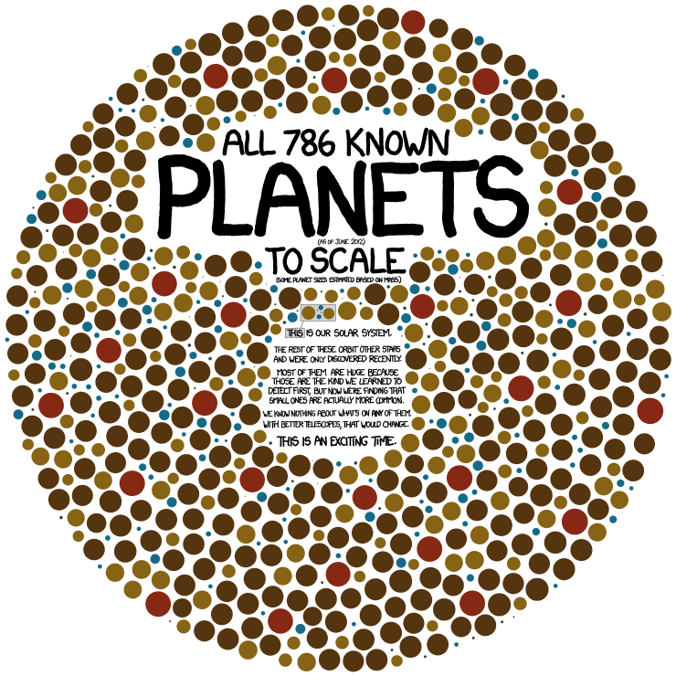
This neat and simple illustration shows the planets known up to June 2012 (we keep finding more), but does not include the unconfirmed Kepler candidates. As you can read in the text, if you click on the image to see it larger, the sizes are to scale and you can see our solar system for comparison near the center. It's easy to see that most of the planets found thus far are quite large (like Jupiter or even larger). This is an observational bias since these are the easiest to detect.
The color scheme in the figure is not described. At first, I thought it was approximate of the temperature of the planet, which combines the planet orbital radius and the star's temperature, but given no further information I don't want to assume that's the case here. It kinda looks like the Ishihara test they use to check for color-blindness.
Next up is the famous Kepler Orrery:
An orrery is a mechanical device that shows the positions of the planets in the solar system.
This video was created by Dan Fabrycky of the University of California at Santa Cruz and shows the initial Kepler multi-planet systems (from February 2011, so it's a bit outdated) all orbiting their individual stars. The color is representative of the size of the planets (Hot=big, blue=small). There are a few other versions out there, for example this one, though the coloring scheme and the sample of planets shown varies.
This one starts of showing 1236 Kepler planets orbiting a single star, similar to another video I have below. However, it quickly tilts back to show the temperature and radii of these planets as a function of distance. Not only is it a cool video, it also gives you some useful scientific information like the planet's temperature and radius as a function of distance from the star. More details are available at the vimeo website.
This animation was created by Alex Parker of the Harvard-Smithsoniain Center for Astrophysics and shows 2299 Kepler planets as if they all orbited the same star. That's a lot of planets! While this one doesn't provide any explicit scientific information, it emphasizes the sheer number of worlds we've discovered in the past few years. This is certainly an exciting time for extrasolar planet research. The full description is available on the vimeo website.
This last one is for the music lovers. Alex Parker also created this video which assigns piano tones to the Kepler-11 planetary system. It almost sounds like it's reaching some melody.
Did I miss any other great visualizations? Which one is your favorite planet-related video or graphic?
No comments:
Post a Comment
Note: Only a member of this blog may post a comment.